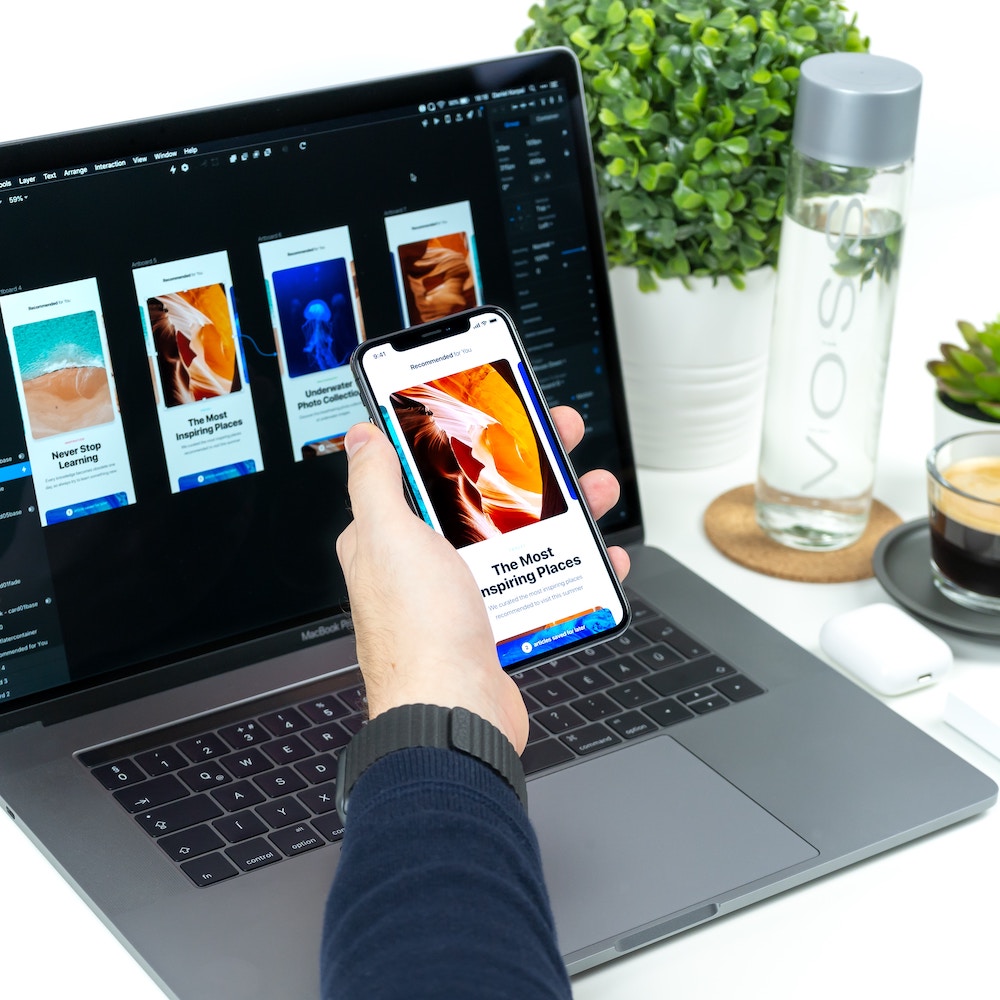
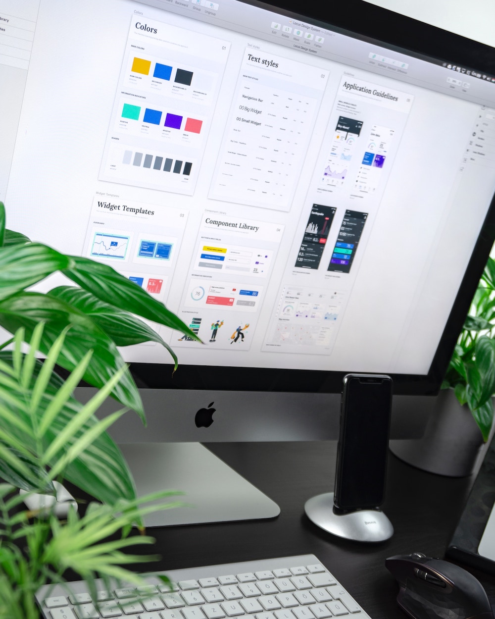
In today’s competitive online landscape, a seamless and engaging user experience is the key to transforming visitors into loyal customers. In this post, we’ll unveil eight simple yet powerful UX design tips that can significantly impact your website’s performance. From optimizing navigation to streamlining call-to-action, we’ll cover a range of strategies to ensure your website attracts visitors and compels them to take action.
To entice more clients, you’ll need a high-quality user experience design. Read on to learn some UX design tips that will boost your conversions.
1. Use Clear and Concise Language
People don’t want to sit down and decipher a wall of text every time they look for products and services. Complex writing slows them down, makes the page difficult to read, and distracts them from their objectives. Using straightforward language, short sentences, and paragraphs of fewer than three lines makes comprehension and retention easier.
2. Simplify Navigation
Navigating your website is critical because it helps users learn more about your offerings. If people are confused and struggle to move through your page, they’ll become frustrated and develop negative feelings about your brand. On the other hand, good navigation makes them more likely to browse because they understand where they are and where they’re going.

3. Use Color Wisely
Since color can impact consumers’ moods and feelings, it’s essential to consider what color evokes what emotion when designing a user experience. Red, orange, and yellow can lift their mood, while blue can keep them calm. Black and white are formal and sophisticated.
The emotions you inspire will define your brand in the eyes of consumers. So do your research, create a comprehensive website, and don’t forget to incorporate brand colors.
4. Keep It Consistent
It isn’t obvious to users when a website’s blog is designed in a completely different style from the landing page. It also is terrible for branding because people don’t see a coherent brand story. But on the other hand, consistency makes you memorable because everyone can visualize your brand’s website, mood, and services as a cohesive unit.
5. Optimize for Mobile
About 70% of web traffic will come from mobile devices in 2023. You need to engage users on the go, and a desktop-designed website will load oddly on smartphones and tablets. Ensure you work with a designer seasoned in mobile optimization and app creation.

6. Incorporate Multimedia
People remember 80% of what they see and only 20% of what they read. Multimedia content like infographics and images make you memorable. Video content can also boost landing conversions by more than 86%, so there are real economic benefits to multimedia usage.
7. Use White Space
White space is the open space between text, images, and graphics. It stops the page from becoming too busy and difficult to digest.
Make sure you put white space between paragraphs and keep margins around the images. This will give readers’ eyes a place to rest while they comprehend the information on your website.
8. Streamline Your Call-to-Action
Your call-to-action should be easy to find in a big, bold font. It should use command words like “register,” “contact,” or “browse.” It also should create a sense of urgency with a low, digestible word count.
A good CTA means more leads and higher conversions. Make sure to be transparent and practical so people feel an immediate need to sign up. Offering something in return for filling out a landing form is also a good idea, so consider giving people a coupon or free ebook if they follow your CTA.
Get Started With Top UX Design Tips
Now that you have some UX design tips to boost your business in 2023, it’s time to start. Elle Marketing is committed to helping you engagingly tell your brand story. Contact us today for a free consultation.

